2021设计趋势:UI/UX篇
编辑导语:转眼间,2020年就要结束了。这一年许多东西都放慢或者停滞了,正如2020年的设计趋势没有发生太大的变化,但是2020年的许多因素却会对2021年产生很大的影响。接下来,本文作者为我们预测总结了2021年的主要趋势。
After months of quarantine and isolation brought on by the global pandemic, we look at 2021 with high hopes and cautious optimism.
由于全球疫情大流行,在经历了几个月的检疫与隔离之后,展望2021,我们依然满怀希望和乐观。
Being such an atypical year, in which time seems to have stopped, there have been no major changes in the trends of 2020, which will continue to dominate in 2021, in fact we can say that some of the trends were influenced by the pandemic and the needs it created in all domains.
时间似乎停在了这样一个特殊的年份,2020年的设计趋势没有主要变化,仍然会持续到2021年;事实上一些设计趋势被疫情大流行所影响,并且它所创造的需求几乎涉及每一个领域。
In the third quarter of the year began to appear, very shy, new influences whose dominance will be felt gradually in 2021.
在今年第三季度,这些影响开始显现出来并将在2021年逐渐显现。
Even if most trends from 2020 will continue to influence the design scene next year, we will try to keep only those that will dominate in 2021.
尽管2020年的设计趋势会继续影响接下来的一年,我们会尝试保持哪些在2021年的主要趋势。
一、Main Trend of 2021
3d is definitely the trend of 2021, because it is found in all branches of design, and the novelty is that it is starting to be used in UI, which until now has been dominated by flat design.
3D无疑是2021的设计趋势,每一个设计细分领域都有它的身影。新奇的是它开始在扁平化所主导的UI领域被应用。
The more and more frequent adoption of 3d is also due to the fact that we have at hand some new software, very easy to use, some even free (Figma for example, it is free for freelancers and has some plugins that make the use of 3d user friendly )
3D越来越频繁的应用,事实上是由于我们拥有触手可及的新软件,这些软件易用,甚至一些是免费的,例如Figma对自由职业者免费,并且拥有方便制作3D效果的插件。
How many of us were not discouraged when they opened complex programs like C4D, 3D Studio Max or Maya? Now with software like Figma or Dimensions CC, any designer can quickly learn how to create beautiful 3d scenarios. These softwares are perfect for a 3D beginner.
当我们打开复杂的软件如C4D、3DMax和Maya,我们很多人都会感到无助。现在,有了像Figma,Dimensions CC这样的软件,任何一个设计师都能学会创作漂亮的3D作品,这些软件非常适合3D初学者。

Another factor that will lead to the more frequent use of 3d is the imminent release of Apple’s Big Sur, the new operating system for Mac. At the time of writing, Apple Big Sur is not yet released and does not even have an announced release date. Big Sur is currently in Beta. The Public Beta version (there is a developer Beta as well) became available on August 6th.
另外一个能导致3D更应用更普及的是即将发布的苹果新操作系统Apple’s Big Sur,在写这篇文章时还没有发布,甚至没有公布发布日期,Big Sur 目前是测试版本,公开的测试版本8月6号可提供,同时有一个开发者版本。
You’re probably wondering how the design world will be influenced by this release. Well, Apple showed us a sneak preview to have a glimpse at how the new Mac interface will look like. The most important changes in design are the introduction of 3d elements (icons), areas with transparency and the abandonment of grey shades.
你可能想知道Apple’s Big Sur的发布将如何影响设计界,苹果给我们展示了一个预览版本关于新的Mac界面会是什么样,设计中最重要的改变是3D元素(icon)的应用,抛弃了灰色阴影,应用透明效果。
二、Ui & IxD Design
1. App vs Mobile web
App与移动端网站
We can agree that in 2021 a website that is not “mobile first” is completely obsolete. In most branches of business the best experience comes if you are using an application, so these businesses focus on their development and implementation.
我们认为2021年不是移动优先的网站绝对是过时的,在大多数业务领域,最好的体验来源于你在使用的应用程序,所以这些企业专注于应用程序的开发和实施。
Online stores, social media platforms, trading platforms, etc., will choose to migrate their customers to apps for a better customer experience and to increase their conversions.
为了更好的客户体验和交流,线上商店,社交媒体平台,交易平台等会选择把顾客迁移到App。
Mobile Website of Mobile App? How do you know which one is better for you or your customer?According to studies, users prefer mobile apps more than mobile websites.
移动端网站和APP,对你和你的顾客来说,你如何知道哪一个更好呢?研究显示用户更喜欢移动App。
Platforms that are paying attention to web based services, will find themselves at a disadvantage, both in how they present themselves to their users and in development as well.
那些把重心放在移动网站服务的平台,会发现不论是向用户展现自身还是发展方面都处于劣势。
According to Forbes.com, mobile users spend almost 90% of their time on mobile apps and just 10% of the time on browsers/ mobile websites.Apps have disadvantages as well, like higher development and maintenance costs.
根据Forbes.com,移动用户在App花费了90% 的时间,而在浏览器和移动网站的花费仅仅为10%。当然App同样有劣势,如更高的研发和维护成本。

2. Colors on White Surfaces
色彩与留白
Colors are one of the most important visual elements of UI design. They can highlight your content and reinforce your brand’s style. A color theme should be designed to be harmonious. It should help the UI elements and surfaces to be easily distinguished from one another.
色彩是UI设计中最重要的视觉元素,能强调内容和加强品牌识别度;一个色彩主题设计应该是和谐的,它能帮助UI元素和外观很容易彼此区分开。
The surfaces are the tiles, cards, sheets and components that are placed on top of the background. These cards are white and have a smooth shade that creates a floating effect.. Usually the background is white or a very light grey.
外观包括标题、卡片、表单以及置于背景层上的元素。这些卡片是白色的并且有柔和的阴影过度,这样能创造一种悬浮效果;通常背景是白色的或者是浅灰色。If you don’t want to spend time
choosing your color palette, there are websites that can help you by generating beautiful and vibrant mixes.
如果你不想在选择色彩板选择上花费太多时间,这些网站能帮助你生成漂亮的丰富的色彩组合。例如: https://flatuicolors.com/ or https://colorsupplyyy.com/app/

3. Widget sizing
组件大小
IOs 14, is here and it’s bringing some new changes that will affect all UI Design.Widgets come now in three sizes: small, medium, and large and you can smartly rearrange them between app icons. A designer must create a widget icon in all 3 styles, so the user can choose which one to use.
IOS 14带来的一些新改变会影响整个Ui设计,组件有小、中、大3个尺寸,你能迅速地在APP图标之间排布,设计师必须设计3种尺寸风格的组件,因此用户能选择其中的任意一种使用。
Each size of the widgets lets you display a different amount of information, so you need to be clear and display the right content. Remember that larger widgets allow you to show more data and information.
每一种尺寸呈现的信息量是不一样的,所以你需要清晰的展现正确的内容,更大的组件能呈现更多的信息和数据。

4. Animations & Interactions
动画与交互
Animations are an important part of an app’s design and user experience. These days, a design seems unfinished and static if it doesn’t incorporate an animation.
动画是APP设计和用户体验中的重要部分,当下,如果一个设计是静态没有相应动画,似乎就是一个半成品。
There are many ways to create them and here are some of them:JSON (stands for Javascript Object Notation) takes your images & animations and renders them into a code.
有很多方法制作动画,这里就有一些:JSON能将你的图片与动画渲染成代码。
The advantage of JSON animations is that it is a fraction in size compared to a GIF and it supports full transparency ( no BG needed).
JSON动画的优势是,相比于GIF它比较小并且支持全透明。
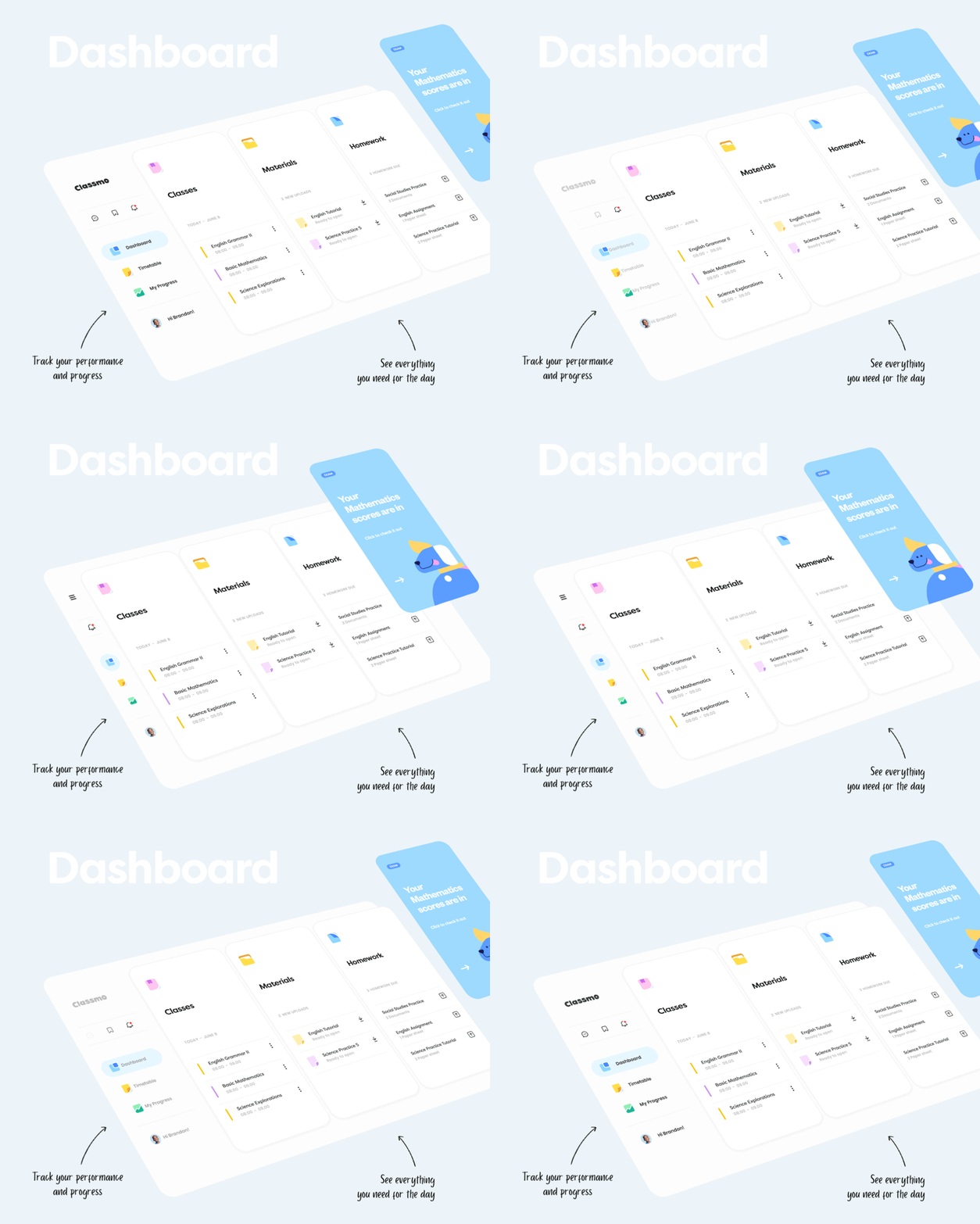
A couple of years ago, the guys at Airbnb have created a tool named Lottie, that makes small animations really easy, using JSON files. Lottie is an open-source library for iOS, Android, and React Native that renders animations in real time. If you haven’t tried it yet, you should definitely give it a chance.
几年以前,Airbnb的一个家伙创造了一个名为Lottie的工具,这个工具制作小动画非常容易。Lotties对于IOS、安卓和RN都是开源的库,能实时渲染动画。如果你还没有用过,应该尝试一下。
5. Custom made 3d Icons
3D图标
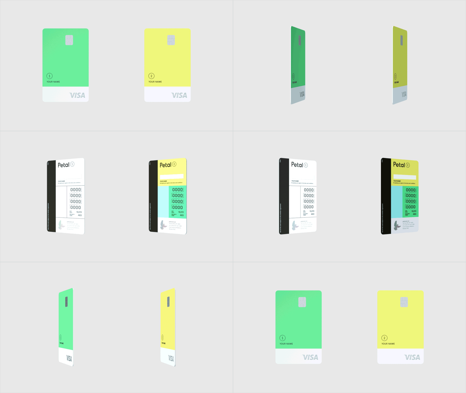
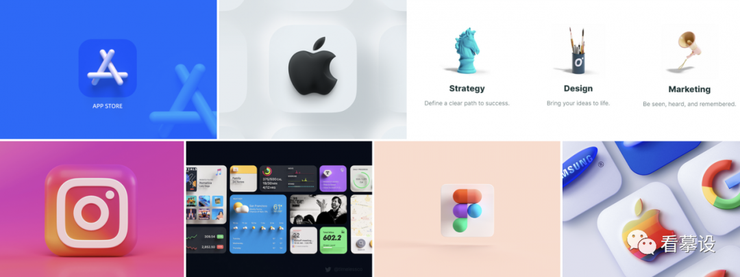
So far we think everyone has realized that 3d is an important category in design. Now it influences the Ui segment more than ever. 3d icons are the new UI trend in 2021 so if you are bored with the flat icons, which have dominated the Ui scene in the last decade, then you can try the 3d ones. The final project will look fresh and modern.
到目前为止我认为大家都认识到3D是设计的重要部分,现在它对UI的影响超过以往任何时候。3D图标是2021年的设计趋势,因此如果你已经受够了主宰UI设计近10年的扁平化图标,可以尝试3D图标了,这会比较新颖和时尚。
三、Illustrations
插画
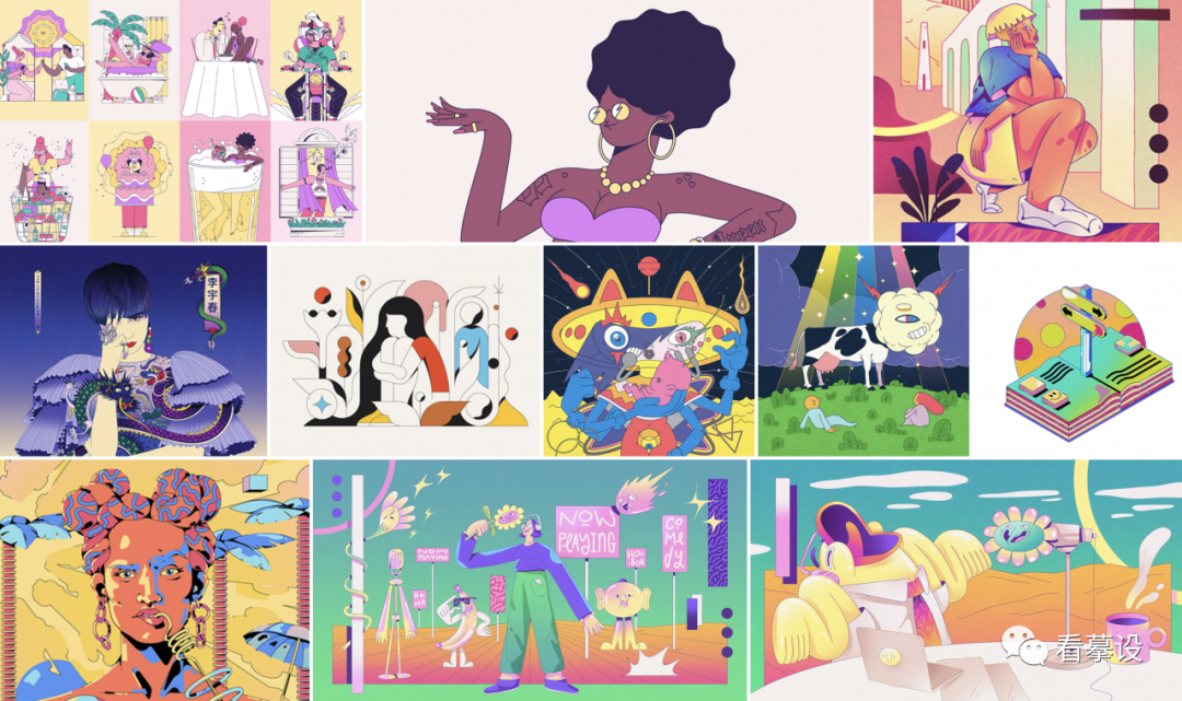
1. Thin Outline in Illustrations
插画——插图中细轮廓呈现
We predicted this trend last year in our Trend Guide. Illustrations in 2020 were dominated with this particular style of drawing and will continue to be in 2021 as well. Because this trend seemed to take off especially in the last semester of this year, we decided to call it the main trend in the category of illustrations for 2021.
在上一年的趋势指导中我们它进行了预测。2020年的插画被这种特殊的插画所主导,并且会持续到2021年,因为在今年上半年这种趋势似乎已蔚然成风,我们决定把它作为2021年的插画主要趋势。
2. 3D
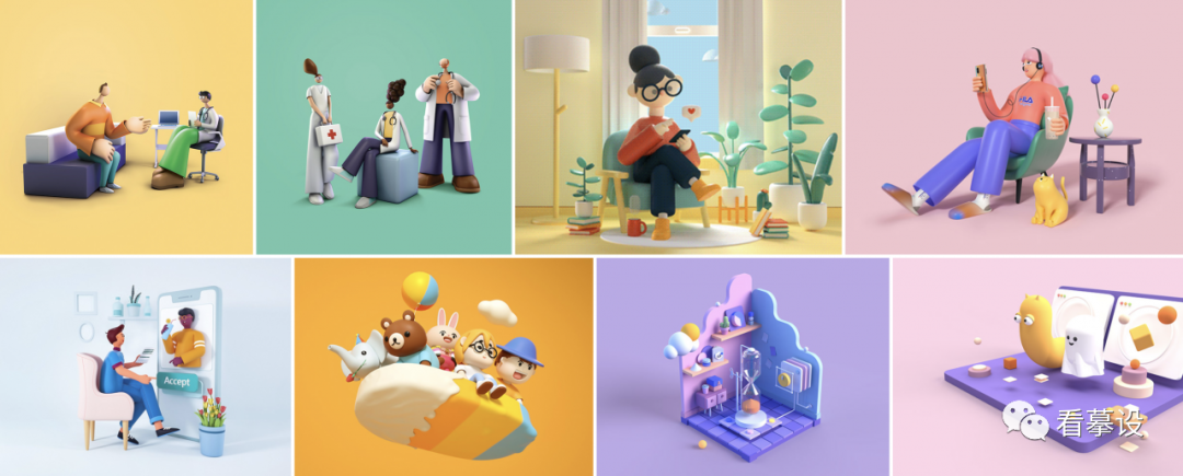
The fact that 3d has taken by storm the design scene in recent years is no surprise. 3D has evolved a lot and is presented with some very polished illustrations that impress the viewer.
事实上,近几年3D在设计中风起云涌的运用并不奇怪,3D改变了很多,光滑的外观形象很是给观看者以深刻印象。
The colors used are strong or pastel, depending on the message they want to convey. The difference from previous years is that 3d illustrations are more minimalist, as if inspired a little by the simplicity of flat design.
使用的色彩表现力强还是粉色调,这要根据所要传达的信息进行运用。与去年不同的是,3D插画形象更小,似乎是受到简洁的扁平化设计的启发。
四、Motion Design & Interactions
动效与交互
1. TikTok & Instagram Reels
Reels are a short and entertaining video content format. These short videos can be used as effective marketing strategies. With the launch of Instagram Reels, an alternative to TikTok, big companies have started using this tool to promote themselves and grow their reech.
Reels是短娱乐视频内容形式。这些短视频能被用作有效的市场营销策略,随着TikTok的替代品Instagram Reels的发布,大公司已经开始使用这个工具来做为自己企业做宣传并扩大影响。
These videos are no longer just made as a pastime for teenagers, but the big brands pay agencies to deliver such reels to them. If you’re already using social media for your business, it may be worth giving Instagram Reels or Tiktok a try.
这些视频不再仅仅为了青少年的消遣而制作,大品牌向宣传商支付费用从而向年轻人推广他们的宣传视频。如果你的企业已经在用社交媒体,那么Instagram Reels或TikTok也许值得一试。
2. Animated Logos
动效LOGO
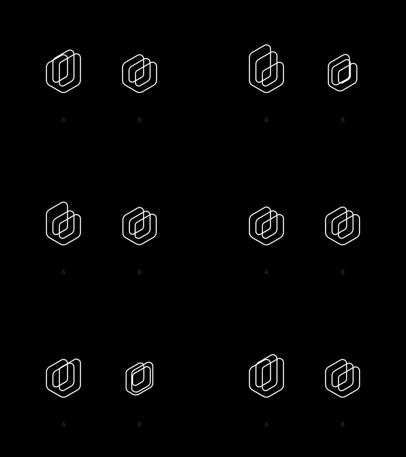
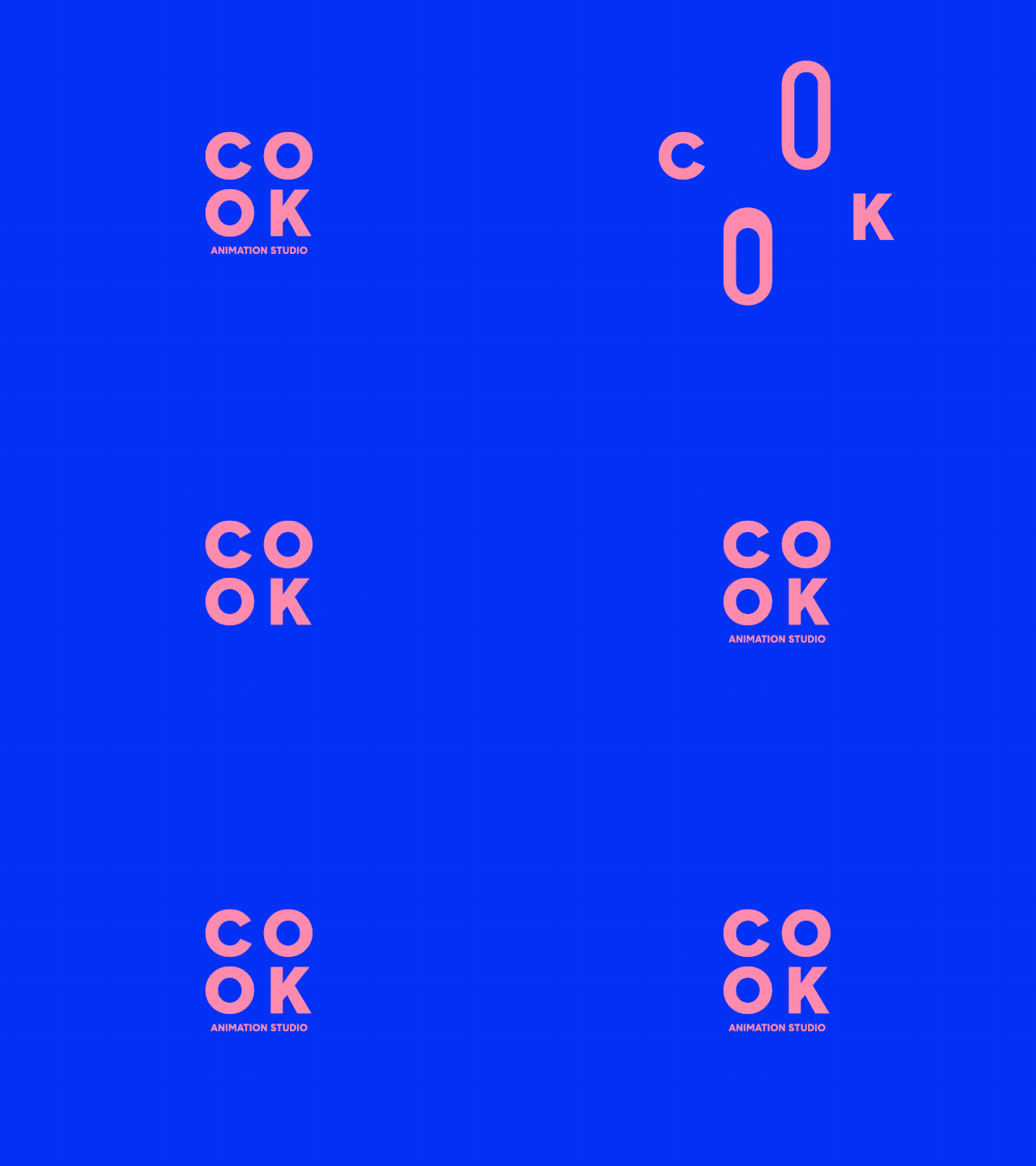
Animated logos have been present for several years but now they are very visible and have taken by storm everything that means branding, so they deserve a mention this year as well.
动效logo已经出现了很多年,但是现在非常盛行并且用尽一切能传达品牌,因此今年也应当受到重视。
A logo is the first thing we see when entering an app, so it should be memorable using only a symbol or a typeface. Combining the logo with a smooth and sleek animation, you can achieve a memorable outcome for any company.
我们使用APP第一眼看到的就是logo,logo应该是易记忆的,且只用一个象征性符号或字体。logo融合流畅自然的动效,使得任何一个公司都能深入人心难以忘却。

这些趋势都在意料之中?,还是……你有不同的看法?
翻译自:Milo 2021设计趋势
译者:虫二无二;公众号:看摹设
本文由 @虫二无二 翻译发布于人人都是产品经理,未经作者许可,禁止转载。


 起点课堂会员权益


动画格式svga不是更小更兼容吗
json更适合
这是外国的流行趋势吧,中国应该有很多不同的
b端和c端产品
平台流量
rellay?